Landcarer

Quick Overview
Landcare Australia is seeing very little engagement of their community conservation website - Landcarer.
My Task was to investigate what was causing the low engagement rate and propose a end-to-end refesh of the existing homepage to help Australians find and participate in local conservation events.

About
Landcarer is a digital platform launched in August 2022 with an ambitious vision: to help Australians find and participate in local landcare and conservation events. But after launch, something wasn’t clicking. Despite their best intentions, the platform was experiencing low engagement and a lack of community involvement — a major roadblock to its mission.
That’s where I came in.
My role was to lead the UX research and design a homepage refresh, grounded in real user needs.
This case study walks through how I used empathy, research, and iterative design to reimagine Landcarer’s homepage — making it easier, faster, and more rewarding for everyday Australians to get involved in conservation efforts.
.jpeg)
.avif)
How do you turn passive interest into active participation?
Opportunity
This project presented a meaningful opportunity to bridge the gap between user intent and platform engagement. Landcarer had already built a tool with purpose — helping Australians connect with local conservation efforts — but its low engagement signaled a misalignment between user needs and the product experience.
As a UX designer, this was a chance to:
Uncover hidden friction points through in-depth user interviews and usability testing.
Translate real user frustrations — like time constraints, unclear navigation, and information overload — into actionable design opportunities.
Reimagine the homepage experience to reduce cognitive load, surface relevant events faster, and empower passive users to take action.
Create a design system that supports both ends of the ecosystem: volunteers looking to participate and organisers looking to engage their communities.
Beyond just solving usability issues, this project was an opportunity to spark a ripple effect: more intuitive event discovery → more participation → more community impact. It highlighted the power of thoughtful design to make it easier for people to do good — and showed how small shifts in UX can create measurable change in the real world.
competitive Analysis
The goal?
Understand how successful platforms structure their user experience, surface content, and foster engagement.
Navigation
is
everything
The best platforms featured intuitive, nested navigation with clear call-to-actions (CTAs) for different user groups.
Visual storytelling matters
High-quality imagery, real photos, and videos drew users in and helped tell a compelling story.
Multiple access
points
Users could jump into events, discussions, or resources via multiple entry points — reducing friction.
Better filtering, better UX
Clear categorisation (e.g. by state, skill level, event type) helped users find what mattered to them faster.
User Behaviour & Interviews
Over two weeks, we spoke with 27 users across Australia. From uni students to long-time volunteers, the stories were varied but shared similar pain points.
Offline Behaviour:
Senior users rely on traditional media — local newspapers, flyers, radio — and prefer email or WhatsApp over modern platforms.
Some users said physical newsletters were faster and easier to browse than websites.
Online Behaviour:
20% of users discover events through Facebook or council websites.
Younger users prefer Reddit, YouTube, and Wikipedia for learning and engaging.
Passive consumption is common — many browse but don’t interact unless prompted.
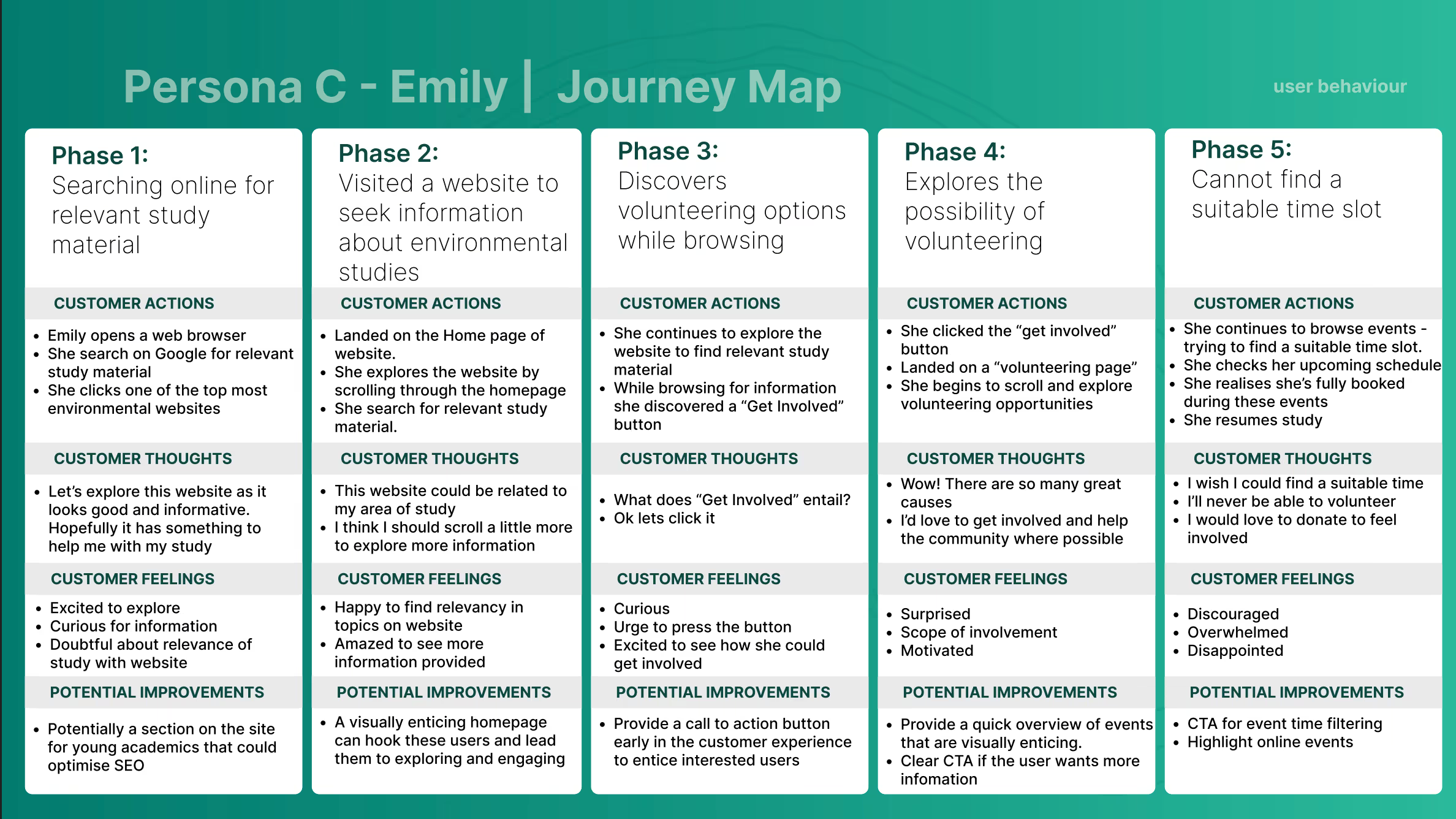
Personas
From our interviews, three core personas emerged — each with distinct motivations and barriers. These helped guide our design decisions and content hierarchy.


User Journey Maps
We mapped out the journeys for each persona to capture emotional highs/lows, friction points, and unmet needs — and to visualise where the platform could do better.


The Engagement Gap
Why aren’t more people showing up to support local conservation?
Landcarer was built with heart — a platform meant to connect Australians with landcare and sustainability events in their communities. But a year after launch, engagement was surprisingly low.
People cared.
They just weren’t showing up.
What I discovered was a shared mission... split in two.
On one side: Volunteers
They were motivated.
They wanted to help.
But they couldn’t find events that worked around their schedules.
“I’d love to help, but I don’t even know where to start.”
“I just wish I could filter events by when I’m free.”
They were browsing passively, often stumbling across events on Facebook or local council pages — hoping for a perfect match that rarely came.
On the other side: Event Organisers
They were pouring in time, energy, and care.
They were posting in WhatsApp chats, putting up flyers, and sending emails to dwindling lists.
Most events got only a handful of participants — sometimes none.
“We just need people to show up.”
If I had even a few more regular volunteers, it would change everything.
There wasn’t a lack of enthusiasm — just a lack of alignment.
Volunteers and organisers wanted the same thing.
But the platform wasn’t built to help them find each other.
It created a cycle of inaction.
More Than a Homepage
I realised that solving this wasn’t just about “making a better homepage.”
It was about closing the gap — designing a way for volunteers and organisers to connect at just the right time, in just the right way.
That’s what the rest of this case study is all about.
Low-Fidelity Prototypes
With our insight clear — a disconnect between organisers and volunteers — I set out to design a homepage that could bridge the gap.
But there was one catch:
I had just a few weeks left to get it done.
I began translating research into raw concepts — layouts, filters, CTAs, content blocks — anything that could reduce friction and create flow.
Using what worked from the sketching stage, I created low to mid-fidelity wireframes — enough to communicate structure without getting caught up in aesthetics.
Then, I tested them with users.


High-Fidelity Prototype
With validated ideas in hand, I moved into high fidelity — crafting a homepage that was clean, clear, and inviting.
It was designed to serve both groups:
Volunteers can now quickly filter by time, location, and interest.
Organisers get their events front and center, with visual appeal and easy promotion.

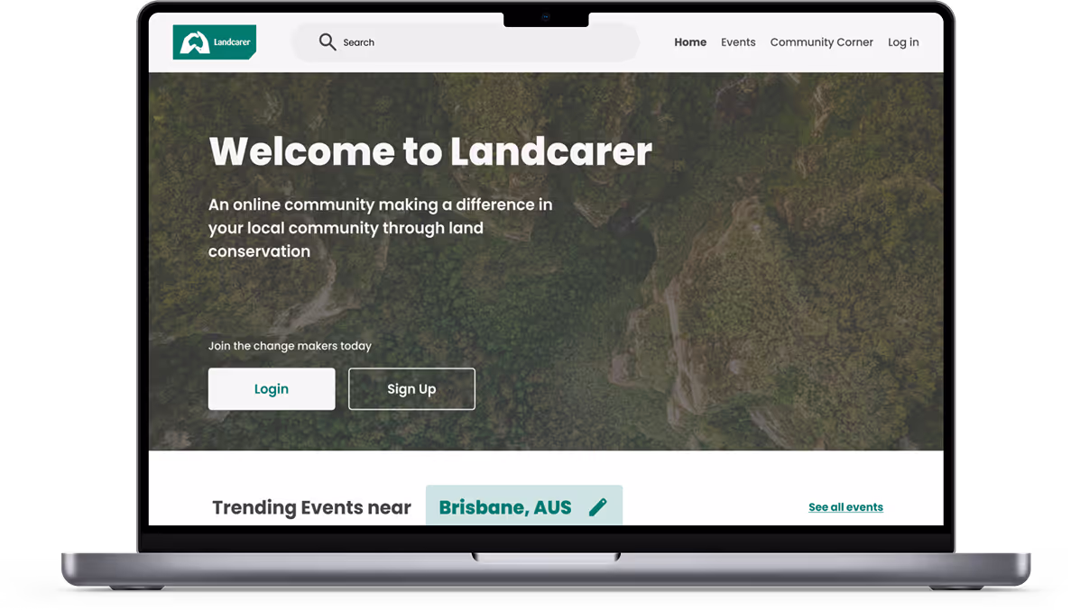

Smart, Location-Based Event Discovery
What it is:
A reimagined event section that highlights relevant local events based on where the user is — or where they want to look.
“I finally know what’s happening near me — and when.” — User tester
Why it matters?
Users told us the biggest barrier was not knowing where or when events were happening. The previous site buried this information, forcing users to dig.
What changed?
Instead of hiding event listings behind state filtering buttons, the event list is now the hero of the homepage—with filters for location, date, and interest clearly visible up front.
Events are automatically filtered and displayed based on proximity to the user.

Robust Filtering & Time based options
What it is:
Filters that allow users to sort events by date, skill level, duration, and even age suitability.
Why it matters?
One of the biggest insights from user interviews?
“I want to help… but I literally don’t have the time.”
Users couldn't filter to events that matched their availability so they assumed that there was nothing for them.
What changed?
Instead of a one-size-fits-all list, users can now tailor the platform to their own availability — making participation possible.

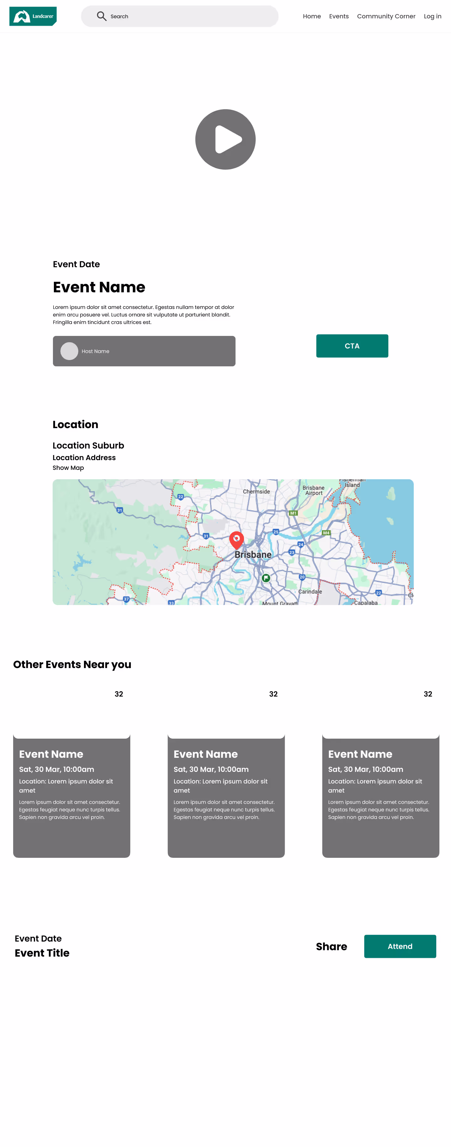
Event Recaps for Instant Clarity
What it is:
A preview component that gives users a quick glance at what an event involves — who’s running it, what to expect, and what to bring.
Why it matters?
Users told us they didn’t attend events because they felt uncertain or unprepared. “How long will it take? Who’ll be there? Is this for me?”
What changed?
Each event now includes a visual recap panel that answers the key questions upfront, building confidence and reducing commitment anxiety.
Clarity leads to confidence — and that leads to action.
.avif)
Prominent, Purposeful CTAs
What it is:
Clear “Get Involved” and “Attend” buttons placed strategically throughout the page — not just at the top or bottom.
Why it matters?
On the old homepage, CTAs were sparse or buried — meaning users had to hunt for how to take the next step.
What changed?
CTAs are now visible at every scroll point. Whether you’re skimming or exploring deeply, there’s always a clear action to take.
And for users like Claire, who want to explore before committing?
They can follow local events or topics and ease into the experience — no pressure.

Checkout the Prototype

Conclusion & Reflection
This project taught me that the real blockers to engagement aren't always obvious.
People wanted to help — they just didn’t know how, or didn’t feel confident doing it.
By talking to real users, I learned how small UX changes — like clearer CTAs, better filters, or helpful event summaries — can unlock big impact.
Working with tight deadlines forced me to focus on what mattered most:
Empathy, clarity, and action.
If I had more time, I would’ve loved to speak with more active users already engaging with the platform — to better understand what’s working today. I’d also run A/B tests and multiple design iterations to refine the UI and ensure we’re making measurable improvements over time.

.avif)